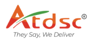
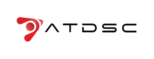
How We Modernized the Logo of a 12-Year-Old AV Industry Giant, ATDSC for Today’s Market?

Client
ATDSC
Industry
Automobile
Duration
1 year

About the Client

ATDSC is a premium audio-visual product making company that is the leading force in India for integrated AV automation solutions. ATDSC is backed by a lively and robust team with 12 years of experience. The brand is well known for innovation, high-performance AV systems, and a drive for total 360-degree tech solutions with a national reach. The team is never outdone whether for commercial spaces, home automation, or institutional infrastructure. ATDSC always delivers and consistently surpasses expectations through its laser focus on quality and client satisfaction.

The Objective

With the brand completing over a decade in the industry, ATDSC wanted to refresh its visual identity to reflect its growth, innovation, and evolving market position. The original logo, though familiar, had begun to feel outdated and didn’t fully communicate the brand’s current values and technological edge. The key goals were:

  • Redesign a 12-year-old logo without losing brand recognition
  • Give it a modern, clean, and industry-relevant look
  • Develop a visual identity that aligns with premium AV technology
  • Satisfy the consistent feedback from channel partners, who have been requesting a new logo.

The problem

While ATDSC had cemented existing brand recall over the years, their original logo felt dated and did not honor the sharp, future-thinking solutions the company had to offer. Some specific challenges included:
  • Keeping visual continuity with the previous identity
  • Modernizing the design while not upsetting long-term customers and partners
  • Creating a logo that works for digital assets, print applications, and product applications
  • Newer expectations from channel partners and customers for an updated look
Digital Zeroz treated the logo redesign as a mix of respect and evolution, balancing their intent to modernize the logo while still keeping the original at the back of their mind. Here is how we executed:

1. Logo Modernization & Conceptual Redesign

We began by dissecting the old logo to identify which elements held brand value and could be carried forward in a refreshed format. The redesign focused on cleaner lines, stronger symmetry, and refined typography to give the logo a professional and modern edge. Subtle tweaks ensured the brand retained its essence while the final output looked significantly more premium and aligned with today’s design standards.

2.Channel Partner-Centric Approach

Since the request to update the logo originated from channel partners, their input played a key role in shaping the design. We involved internal stakeholders in the review process and made sure the final logo not only met internal brand goals but also resonated with partners and client-facing teams. The result was a logo that felt collaborative, accepted, and well-received across the ecosystem.

3. Versatility & Application-Ready Output

The final design was optimized for use across multiple platforms and formats, from product packaging and brochures to website headers, digital touchpoints, and showroom signage. Scalability, readability, and visual clarity were ensured at every size, making the new logo both functionally superior and visually striking.

The Result

The revamped logo was rolled out across all ATDSC brand assets, and it received overwhelmingly positive feedback from both internal stakeholders and channel partners. The new logo retains the same feel/pulse of the original design, while adding a layer of modernity and sharpness to the imagery that better expresses the company’s forward-thinking vision. The advantages of the new logo allow ATDSC to be more consistent, cohesive, premium, and professional in its branding, aligning better with its innovative AV solutions and leadership in the market.